- Rulestar
- Building Forms
- Options
Horizontal or Vertical Layouts for Options
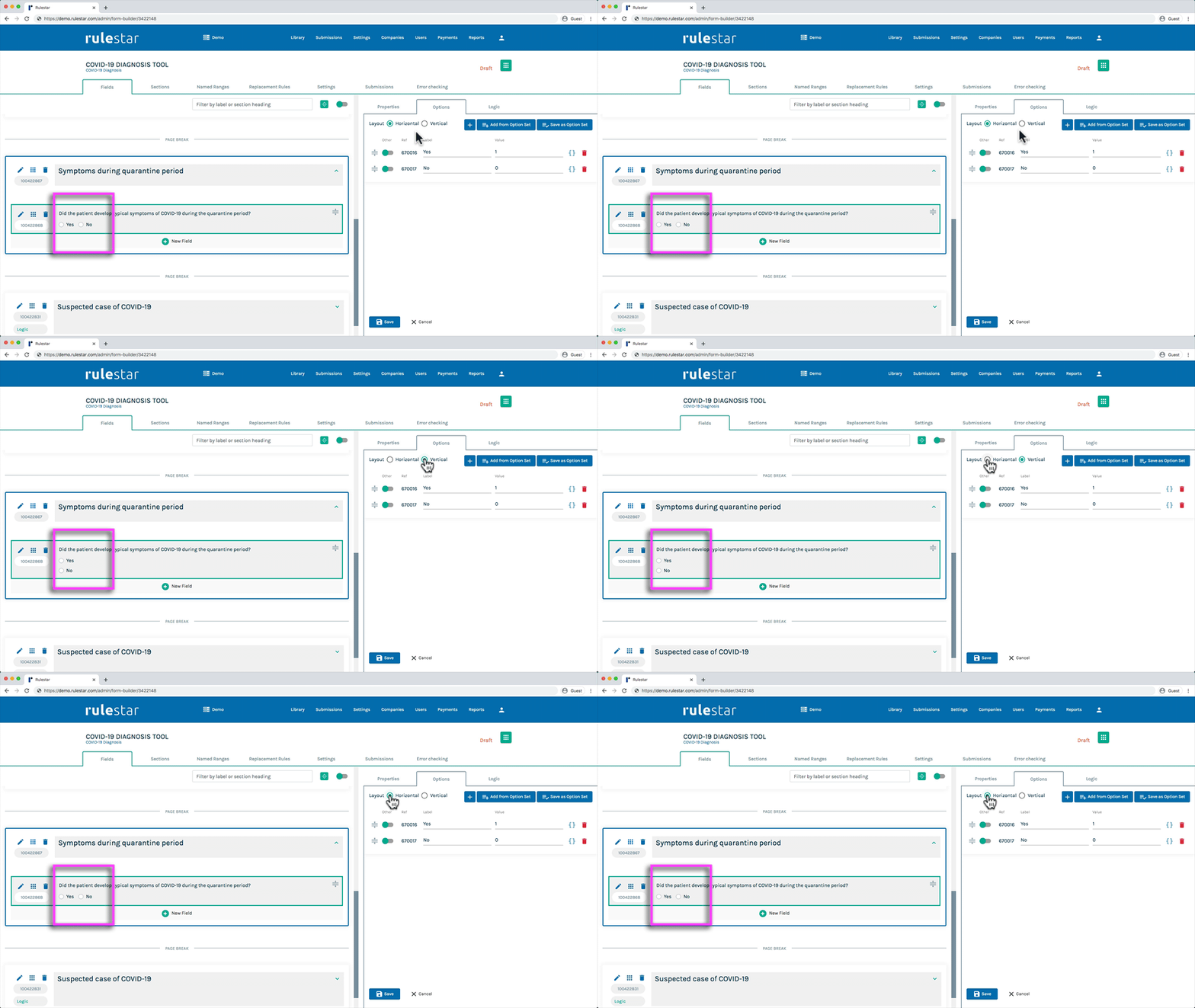
For Radio Button and Checkbox fields, you can choose whether the options will be stacked vertically in the form or placed side-by-side. As a general rule, from a user experience perspective, we recommend stacking options vertically – however, that will make the form take up more space on the screen vertically.
For that reason, and as most questions have simple Yes/No options, you may consider making all Yes/No buttons horizontal, as demonstrated in the image below.

