Reference materials to accompany the Introductory Session (employment offer letter demonstration)
This article is designed to be used as reference material to accompany the Introductory Session, which includes a brief look at all of the basics of the document automation process. During this session, you'll also see a demonstration of how to automate an Employment Offer Letter.
Contents
- Accessing the Rulestar Sandbox
- Dashboard and Library
- Form Builder
- Structure
- Question/Field types
- Field properties
- Logic
- Template
- Signing into the Add-In
- Developer tab - Design Mode
- Merge Fields
- Conditional Content
- Testing
- Uploading the template from the Add-in
- Repeatability
- Run through the Questionnaire as an end-user and review content
- Submissions Table
Accessing the Rulestar Sandbox
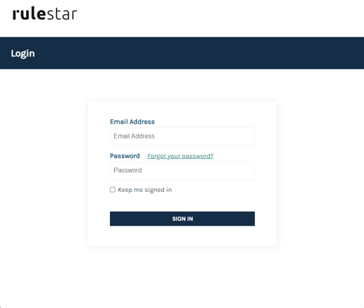
You can access the Rulestar Sandbox at sandbox.rulestar.com. On this page, you are presented with the login screen, where you can enter your Sandbox credentials. If you don't already have credentials, please contact your sales representative or email us at sales@rulestar.com.
Dashboard and Library
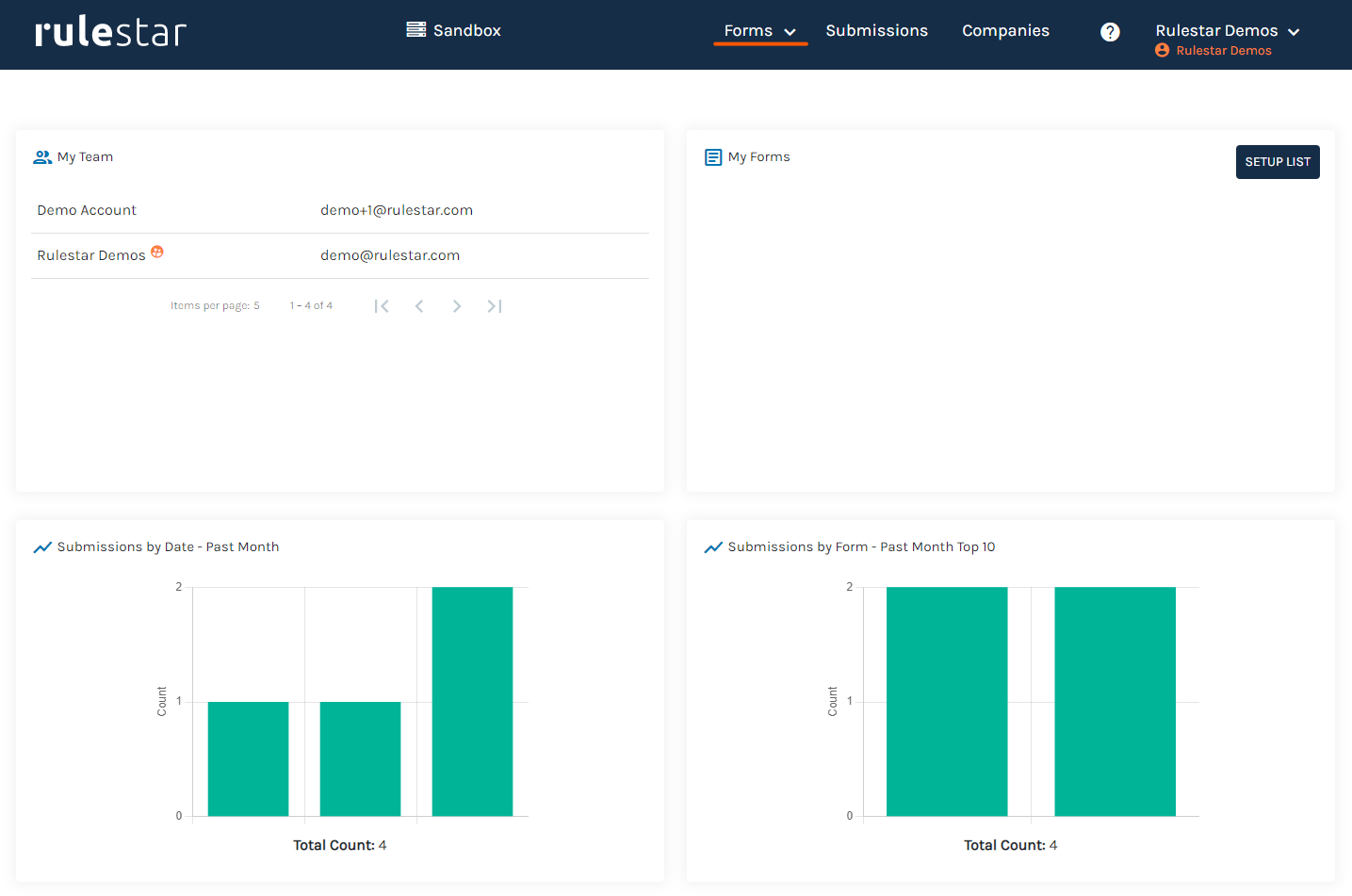
After logging in, the first page you will see in the application is the Dashboard, which contains summary statistics about application usage. The dashboard won't contain much information at first but will be populated over time.
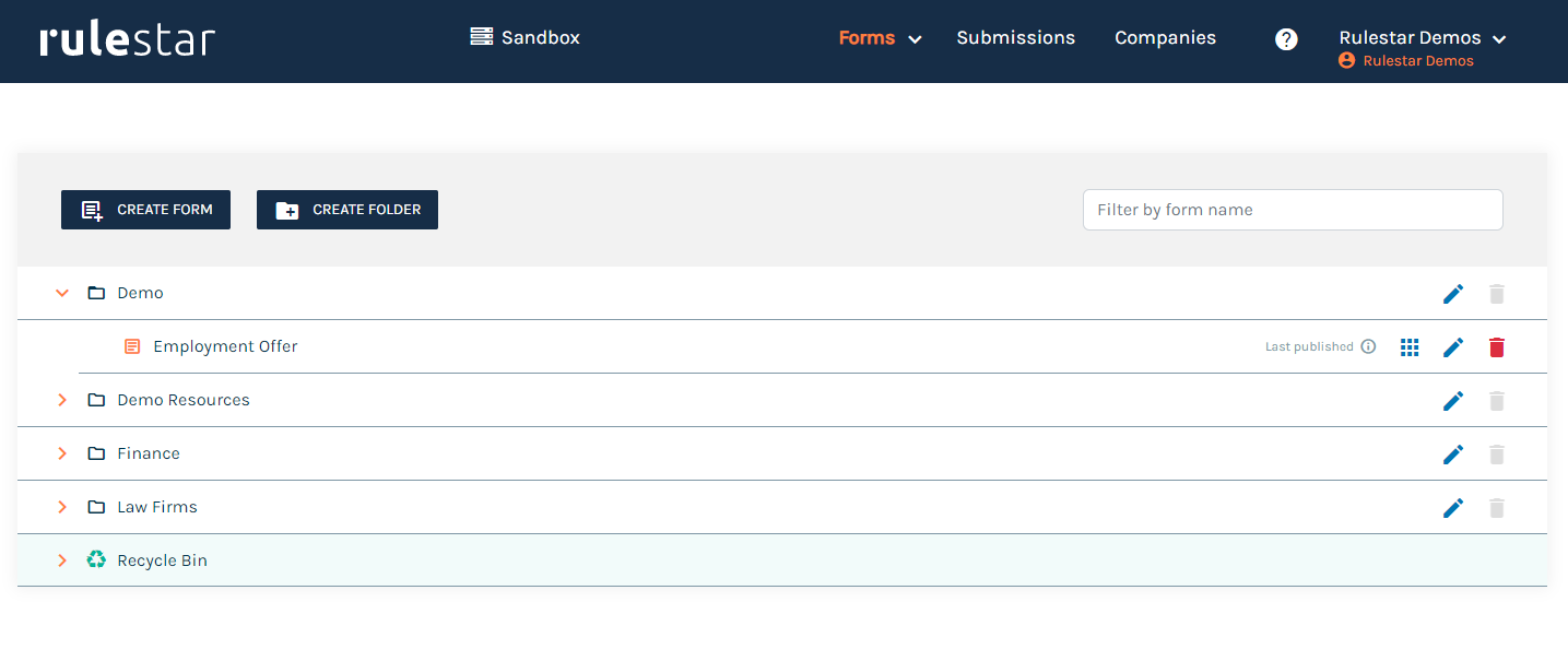
From the Dashboard, navigate to the Library by selecting Forms from the menu at the top of the screen. In the Library, you can see all of the forms available to you. All forms are stored within folders. To open the Employment Offer, select the "Employment Offer" form by expanding he 'Demo' folder and clicking on the form's name. This will navigate you into the Form Builder.
Form Builder
The Builder is divided up into several tabs, arranged horizontally across the top of the page. The Form tab is where we'll spend most of our time as this is where the Form is designed. The Form contains all of the visible content in the questionnaire as well as a lot of other hidden elements like the logical paths connecting each question as well as any calculations or validation rules you use.
Form Structure
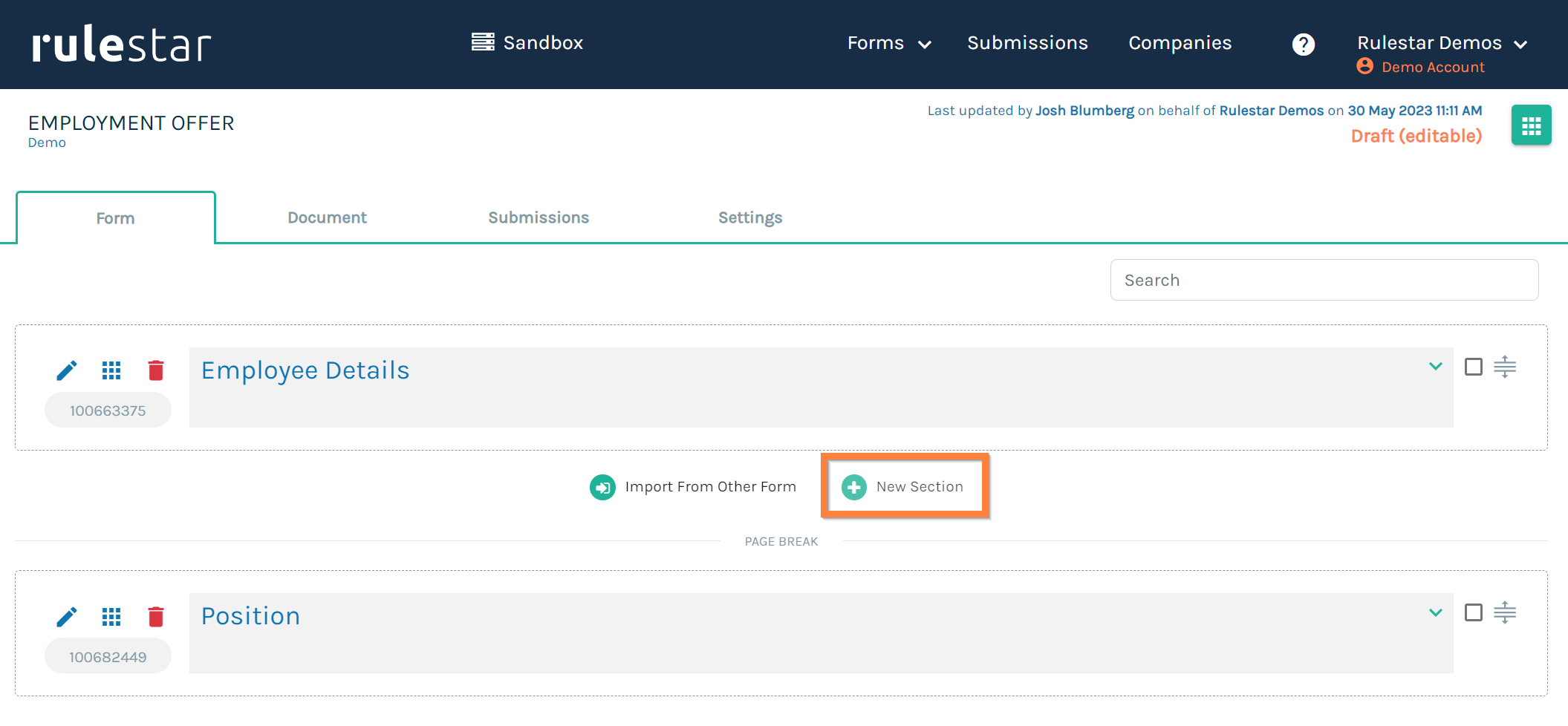
The Form is arranged into what we call Sections. You can think of a Section as a group of questions (or fields) that are connected by theme or logic. A Section can be a single field or many fields and can appear on a new page or continue on the same page following a previous section. Sections can also be repeatable (more on this later) or one-off.
To add a new Section, hover over the white space above or below an existing Section and click on 'New Section'.
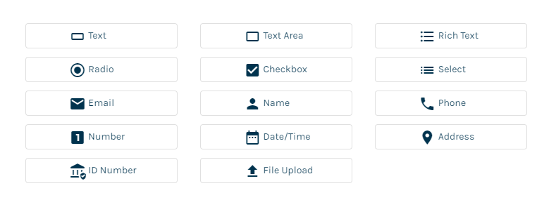
Question/Field Types
There are many different types of fields to choose from when building a form. The choice should be based on the type of input you're expecting from the user completing the form. If you're looking to get a Date of Birth, then a Date/Time field makes sense but if you're looking to get users to choose one of several different responses then either a Radio or Select field will make sense. Learn more about the different Field Types.
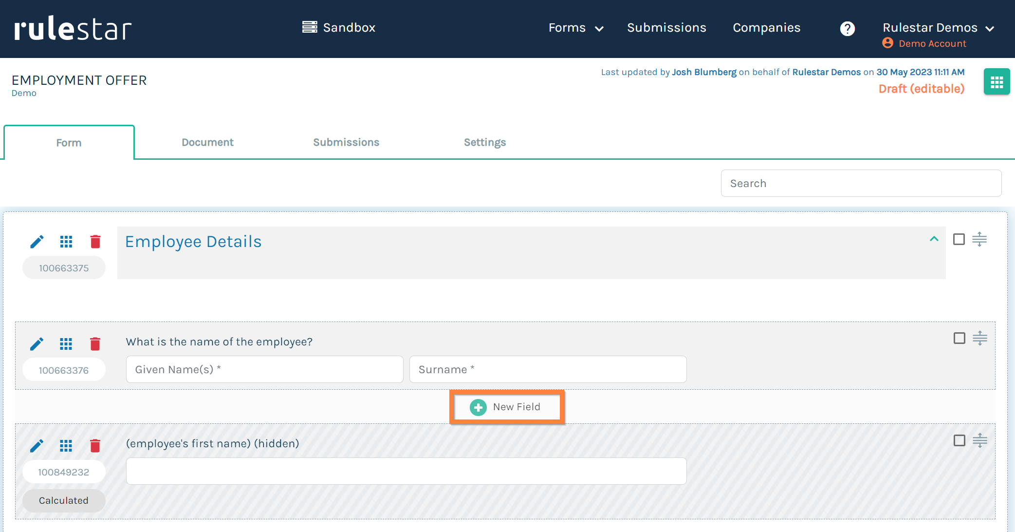
To add a new Field, expand the Section you'd like to place it in and hover over the space between existing Fields (or the blank space in an empty Section) and click on 'New Field'.
Field Properties
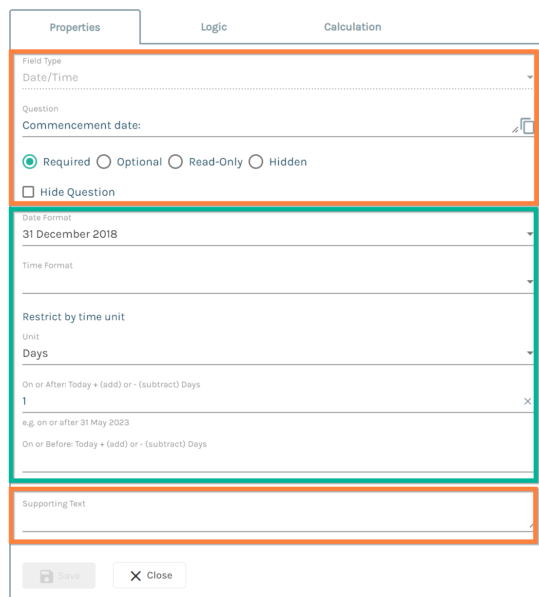
Each of the different Field types has both common and unique properties associated with it. To reveal the properties of a Field, click on the pencil icon (see below) in the top-left corner and select 'Properties' from the dropdown menu.

Common properties (highlighted in orange in the example below):
With the exception of a Rich Text Field (RTF), all field types require you to enter a [unique] Question label that is used to prompt the user for an answer as well as identify the question when creating logical rules or merging content into the document.
Fields must also be either Required, Optional, Read-Only or Hidden. The latter two options are useful for calculated values (more on this later).
You can also add Supporting Text to the field, which can be useful for giving users additional context or guidance on how to answer the question.
We won't go into the unique properties (highlighted in green below) of each field type here but you can find more information by searching the Knowledge Base for any particular field type.
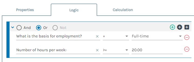
Logic
Logic is what makes a Form appear smart. Rather than asking every user every single question in the form, we can selectively show or hide Fields (or Sections) by using logical rules. By default, when a field has no logical rule applied it will always be shown to the user. As soon as a logical rule is applied, a field will only be displayed if the logical rule resolves true.
To open the graphical logic editor, click the pencil icon in the top-left corner of the field and select 'Logic' from the dropdown menu or if you already have the properties menu open, click on the 'Logic' tab.
A logical rule can be composed of any number of individual logical conditions. Each condition is typically structured in three parts: question, operator and [answer] value. Different field types can be used with different operators. For example, numbers and dates can be used in conjunction with inequalities whilst text fields cannot.
Learn more about Logic.
Templates
Templates are where the content used to assemble documents is stored and managed. Rulestar templates are built in Microsoft Word, ideally, the desktop version for Windows, although the browser-based version is the second-best if you don't have Windows.
MS Word Add-in
The Rulestar Add-in for MS Word creates a dynamic link between the template (which is a static piece of content) and the Rulestar application. You can install the add-in from the Office store within Word. (Before trying to install the add-in, make sure you are signed into your Microsoft Account.) To install the add-in, search for "add-in" and click "Insert an Add-in", click the "Store" tab, search for "Rulestar" and then follow the prompts.
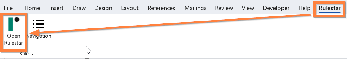
To sign into the add-in, click "Open Rulestar" in the Home or Rulestar tab, "Sandbox" to open the Sandbox add-in, "SIGN IN" and then follow the prompts. Use the same credentials you used to sign into the application.
Once you've signed into the Add-in, you'll be prompted to choose a Form from the dropdown list on the right, which will show you all of the Rulestar forms in your library to which you have access. Once a Form has been selected, you should see the details of the form loaded into the Add-in pane.
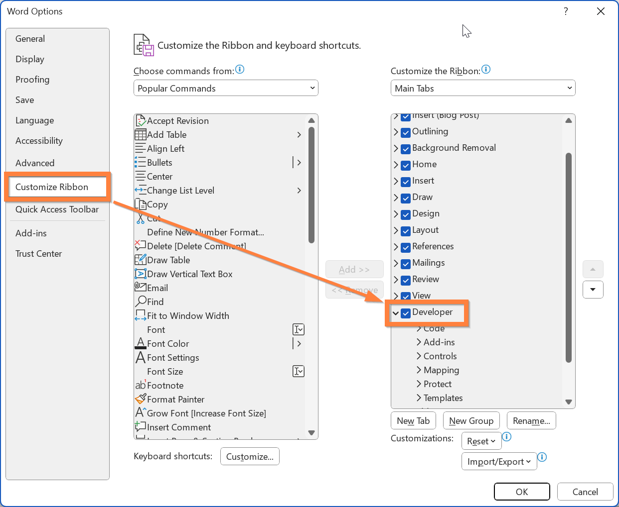
Developer Tab and Design Mode
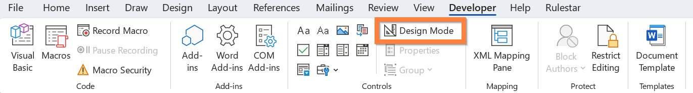
To mark up the content in the template, the Rulestar application makes use of a powerful MS Word feature called Content Controls. The opening and closing markers for these content controls are only visible when you are running Microsoft Word Word in Design Mode, a feature of Word that is only available through the Developer tab, which is itself only in the Windows desktop version of the application. To show the Developer tab, go to File -> Options -> Customise Ribbon, and on the right-hand side check "Developer" (see below).
After clicking on the Developer tab, click on the Design Mode button (see below) to switch it on/off. The majority of the time, it's best to work with Design Mode activated.
If you turn Design Mode off, you'll notice that the opening and closing markers are no longer visible. Sometimes it is useful to turn Design Mode off, especially when previewing formatting or layouts.
When Design Mode is off, if you click on a range of conditional content, Word displays a box around the content that is included in the range, as well as the name that you have assigned to it.
Merge Fields
Marking template content as a merge field is how we insert answers from the questionnaire into placeholders in the template.
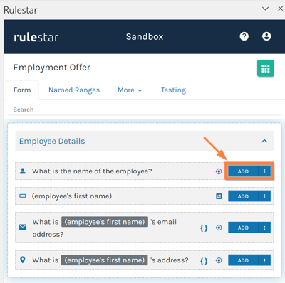
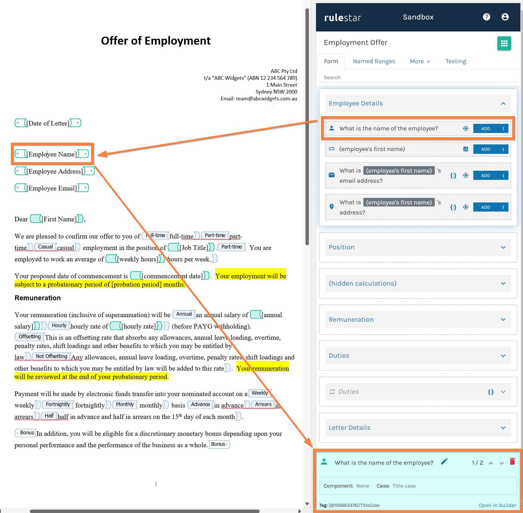
To insert an answer from the questionnaire without using a placeholder, simply place your cursor in the document at the position you would like the answer to appear and click on the 'ADD' button next to the question, the answer to which you would like to be inserted. This will automatically add the characters [*] as a placeholder.
If you would like to use an existing or custom placeholder (this can be helpful to easily identify the content that will be merged into the document), highlight the placeholder in the document and then click the 'ADD' button.
Once you have added the merge field, clicking into the placeholder will display which field has been linked as well as any other properties of that field (e.g. whether it has been merged in Title Case or whether a component of that field is being used such as a First Name or Surname).
Learn more about Merge Fields.
Conditional Content
In a typical document, some of the content will only be included when the questionnaire is answered in a certain way. We call this Conditional Content and it is the second fundamental concept to document automation.
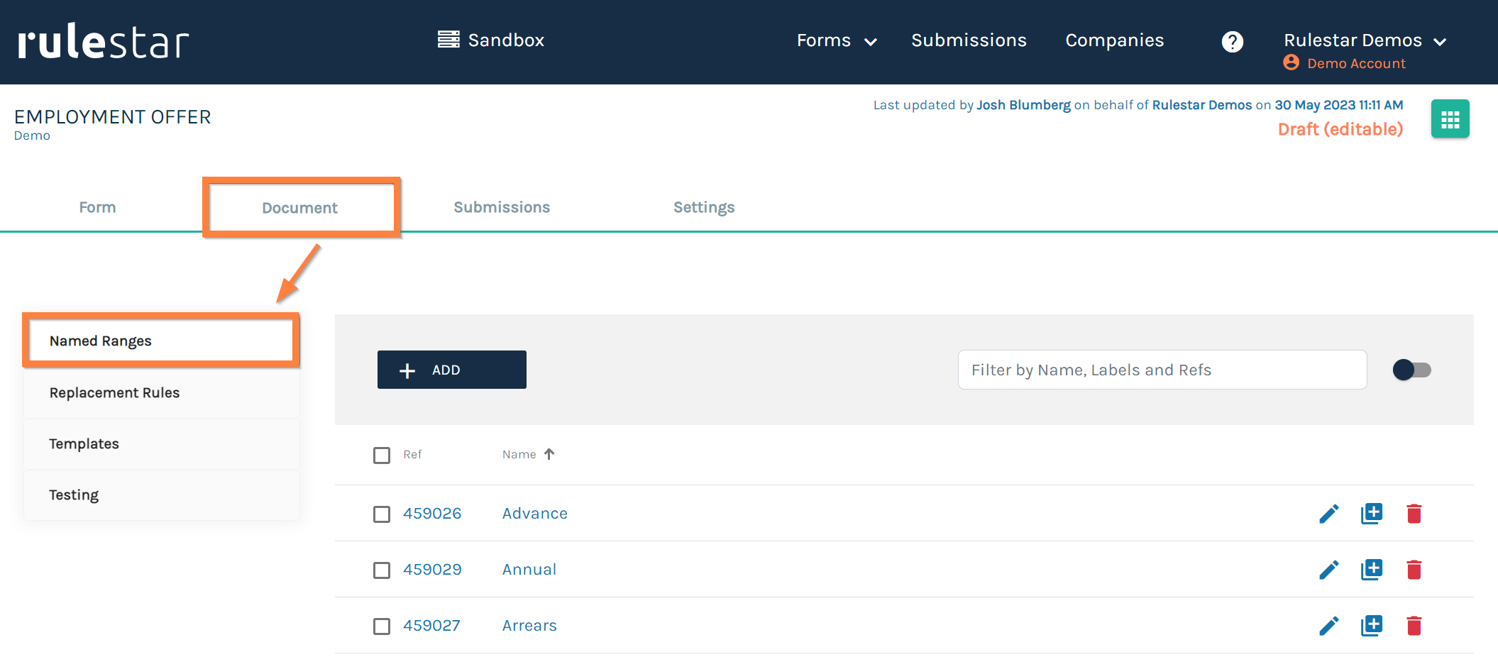
The conditions that govern when content is included are defined in the same way as Form logic. However, unlike in the Form, rather than defining the logic for each piece of Conditional Content, we use variables called Named Ranges, which can be applied repeatedly throughout the template.
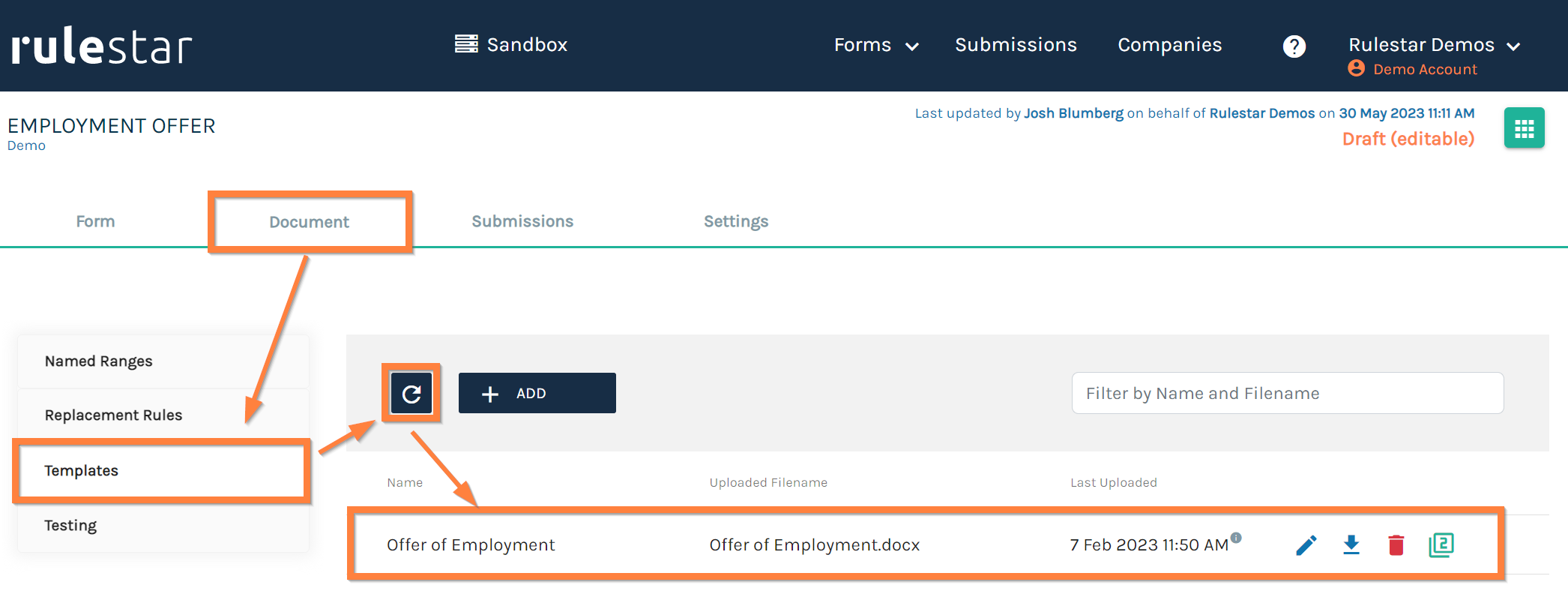
Named Ranges are defined in the web application by navigating to the Document tab and then selecting Named Ranges from the menu on the left (see below). To create a new Named Range, click on 'ADD', give the Named Range a [unique] name and then define the conditions that will need to be satisfied using the same process as described in the section on Logic above.
Once a Named Range has been defined, the next step is to apply it to the Conditional Content in the template. To do this, open the Named Ranges tab in the Add-in, highlight the content that you wish to make conditional and click the 'ADD' button next to the Named Range you wish to use. You should now see a new content control with the same title as the Named Range wrapping the Conditional Content (see an example below).
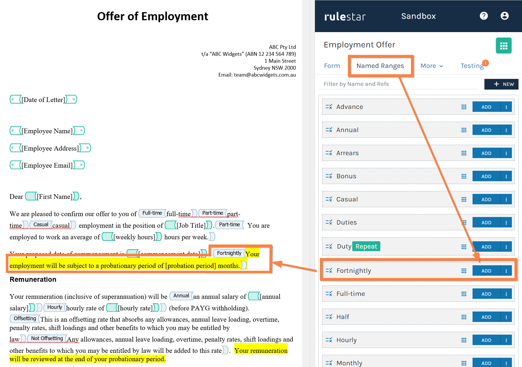
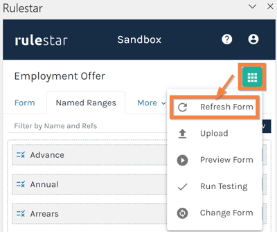
Note, if you cannot see the Named Range you need, you may have to refresh the form (see below).
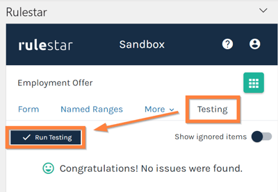
Testing
After marking up your template, it's a good idea to run a test to make sure that everything in the template corresponds to everything in the Form. You can do this with just a single click by navigating to the Testing tab in the Add-in and clicking the 'Run Testing' button. Any issues that need addressing will be highlighted here.
Uploading your template to the web application
Once you've completed testing and you're happy with the template, it's time to upload it to the web application. To do this, save any changes to the template and then select 'Upload' from the green context menu in the top-right of the Add-in.
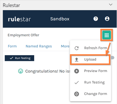
Once you've done this, you should see the template appear in the Templates menu in the Document tab of the web application. You may need to hit the Refresh button first if you don't see it there. If you've uploaded a template with a new name, you may need to delete the old template before running the form.
Repeatability
The ability to repeat content in both the Form and the Template is a key feature of Rulestar that makes it scalable and efficient to automate content.
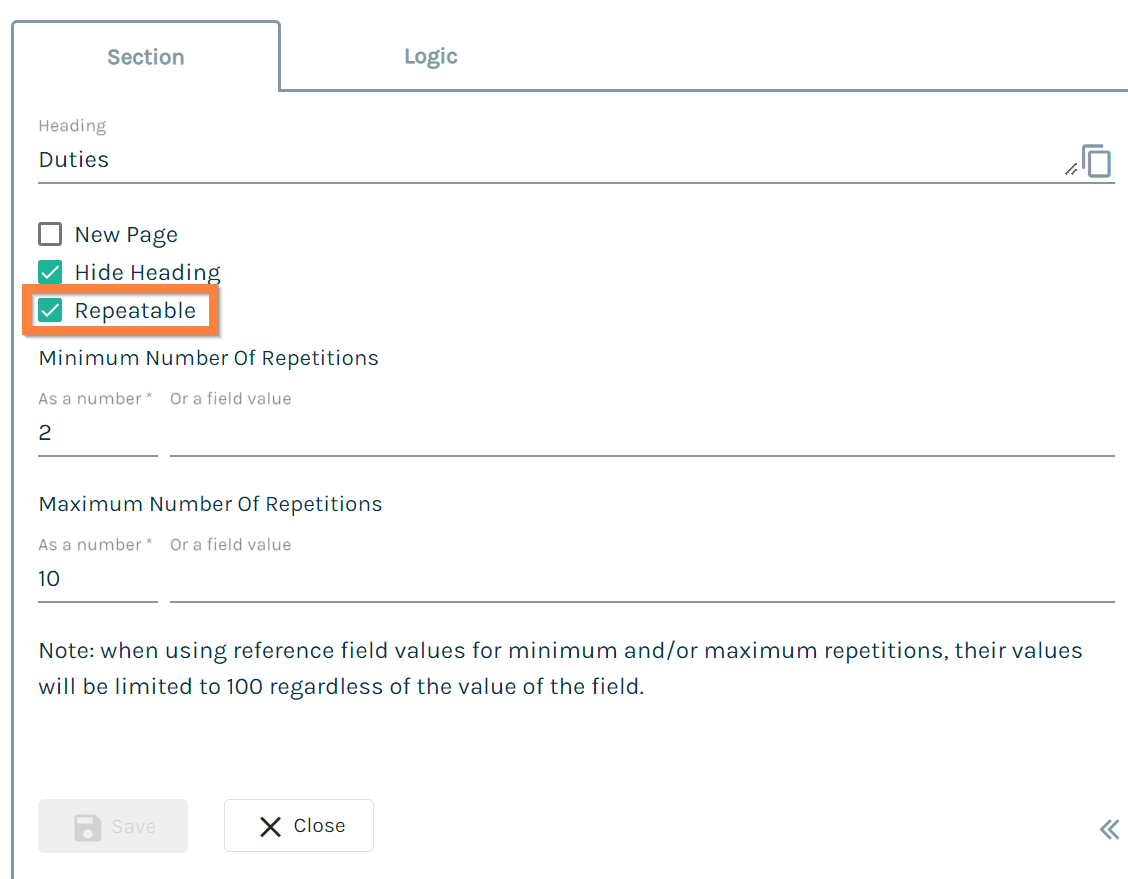
In the Form, repeatability happens at the Section level. A Repeating Section will run through all the questions in that Section each time the end-user hits 'Add Another' in the questionnaire. You can control the minimum and maximum number of times a Section repeats when configuring the properties of a Repeating Section.
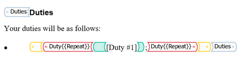
In the Template, repeating content comes in the same two flavours as all other content: Merge Fields (in green below) and Conditional Content (in red below). In the example below, each Duty will be a new list item in the bulleted list.
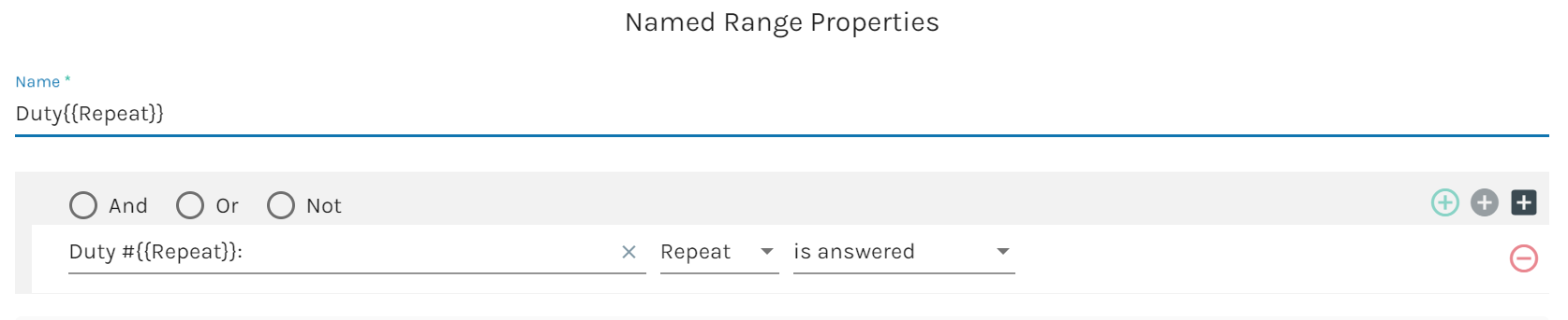
Repeating conditional content must be governed by a repeating Named Range. A repeating Named Range is any Named Range that includes the tag in its name and references a repeating field in the logical condition.
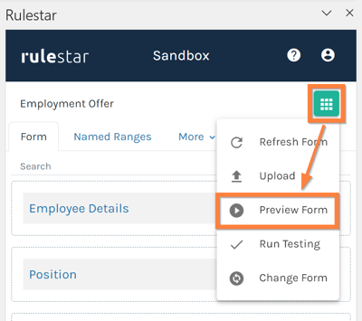
Previewing the Form
In addition to using the automated testing in the Add-in (or application), you'll also want to run through the questionnaire as if you were an end-user. This will help shape the user experience you're trying to create and is a critical part of the automation process.
To preview a questionnaire, click on the green context menu in either the web application or the Add-in and select 'Preview Form'. This will open a new browser tab/window and display the questionnaire, which can be completed and submitted as if you were an end-user. It's worth doing this a few times to make sure you are getting the results you wanted for at least some of the different conditions built into the automation.
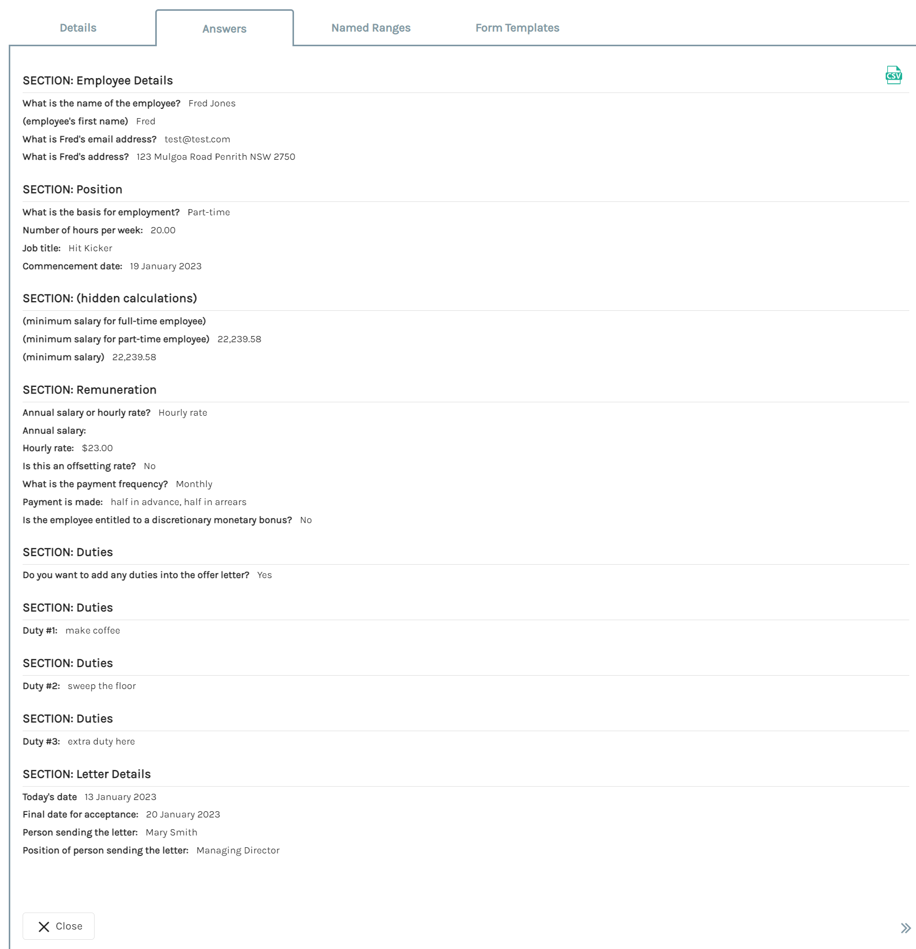
Submissions Table
Once a form has been saved and/or submitted, it will appear in the Submissions table. From here, there are lots of actions we can take, including reviewing all the existing answers without having to go through the questionnaire, downloading the generated document in Word or PDF formats, resuming a partially completed form or cloning/copying a completed one as well as using one of the many integrations available.
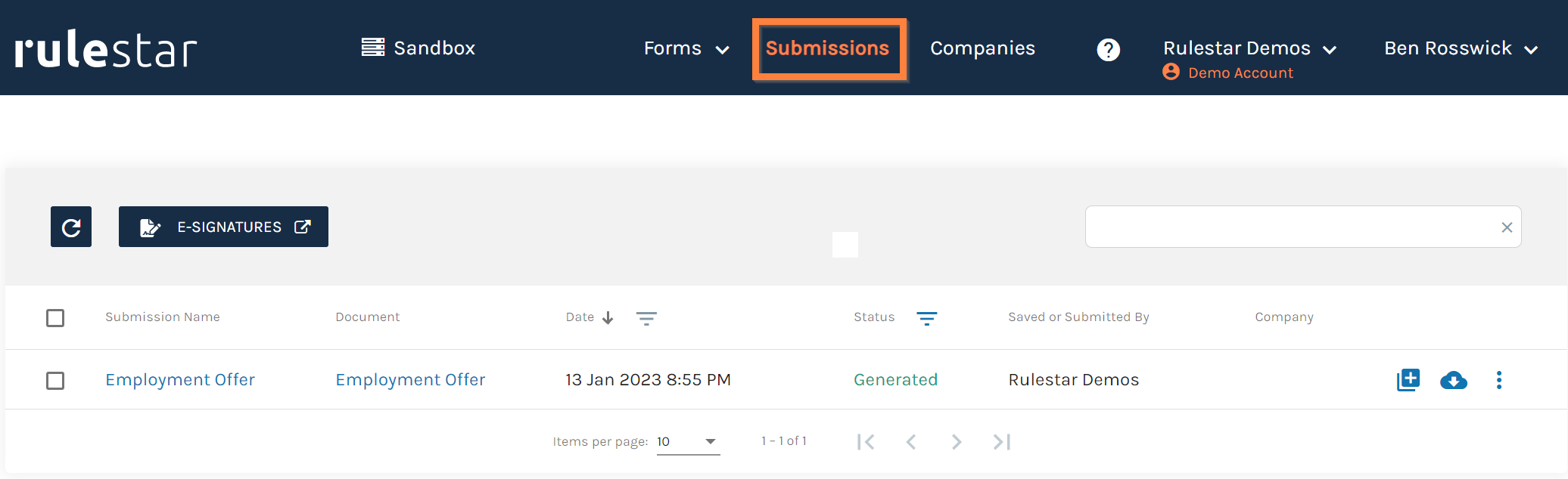
Viewing a submission's details, answers or where a logical rule validated as true/false is done by clicking on the Submission Name (left column), which opens a drawer with tabs corresponding to each of these areas. This can be an excellent way to diagnose why a document was generated in an unexpected manner or simply to review whether a form was answered in a correct/consistent manner.