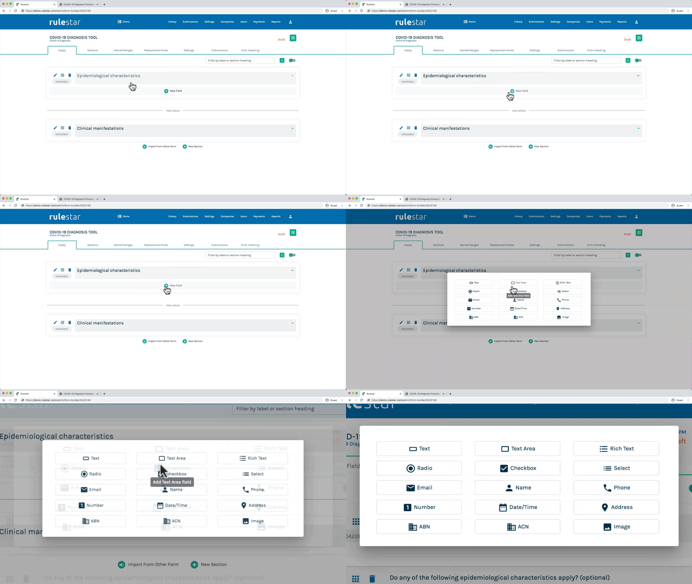
One of the most important considerations when building a smart form is determining what types of fields to use to extract the required information in the most streamlined and robust way. In particular, the aim is to ensure, to the extent possible, that the user can only enter the right type of information in each case.
Types of fields
The platform includes the following field types:
- Text (short answer)
- Text Area (long answer)
- Rich Text
- Radio (also called "Radio Button")
- Checkbox
- Select (also called "Select List" or "Dropdown")
- Number
- Date/Time
- Name
- Address
- Phone
- ABN/ACN
- Image Upload
This article will explain what to keep in mind in choosing which type of field to use.
Single option or multiple option
For Radio Button, Checkbox and Select List fields that contain options, it is crucial to consider whether the user will be allowed to choose only 1 option or multiple options.
If the user is entitled to select multiple options, use a Checkbox field.
If the user is only entitled to select one option, then consider the number of available options:
- For fields that will only have a small number of options – eg, "Yes/No" questions – a Radio Button field is generally preferred.
- For fields that will have a lot of options – eg, a list of countries – a Select List field is usually preferred.
Another consideration is whether you are trying to save space in the form when the user is engaging with it from the front end: Radio Button fields display all options immediately, so if you're trying to save space, you may prefer to use a Select List field so that the options are visible only in the dropdown panel.
Input validation and formatting
In order to minimize the risk of human error to the extent possible, it is crucial to ensure, so far as you can, that front-end users are only able to enter sensible content - ie, content of the right type, in the desired format. For example, if you want users to enter an amount of money, you only want them to be able to enter numbers, rather than letters and symbols. Accordingly, the best choice of field type for an amount of money is a Number field, which only permits the user to enter numbers, rather than, say, a Text field that permits the user to enter free text.
Here's an overview showing the best field type to use for each type of content:
| Desired Content | Field Type | Controls |
| Number | Number |
Number of decimal places |
| Date | Date/Time | Date format Set earliest and/or latest allowed dates |
| Time | Date/Time | Time format |
| Name |
Name |
Name fields capture first name(s) and last name separately. At present, there isn't a separate input for middle name. If you wish to capture middle names separately, you can use a Text (short answer) field for the middle name. |
| Address | Address |
All address fields include a country selector. For addresses in Australia, a 4-digit postcode is required and automatic address lookup is available. For addresses outside of Australia, only one address line is required (ie, state and postcode are not required). |
| Phone number | Phone |
Only numbers, spaces, commas, dashes and + symbols are permitted. There are otherwise no restrictions on phone fields. |
| Email address |
The platform performs basic validation of email addresses to check that they are in a valid format. |
|
| ABN | ABN | The user will be required to enter 11 numbers. An automatic lookup will be performed which will display the details of the ABN holder or a notice to say that the ABN is invalid, as applicable. |
| ACN | ACN | The user will be required to enter 9 numbers. An automatic lookup will be performed which will display the details of the ACN holder or a notice to say that the ACN is invalid, as applicable. |
| Short text answer | Text |
All characters are permitted. |
| Long text answer | Text Area | All characters are permitted. Set minimum and maximum no. of characters. |
| User guidance | Rich Text | This takes a wide variety of html content, including Bootstrap elements. |

